UBS FA Workstation
Project Summary
UBS hired frog to design a new vision for their Financial Advisor workstation. I was Senior Interaction Designer in a team of 4-6 people. The project was broken into two phases and lasted over 7 months. I was client-facing and helped lead the team, which included another interaction designer and visual designer.
In phase 1 we delivered a design language demonstrated across several products. In phase 2, we went deep into the experience of the portal itself, focussing on navigation, search, and notifications. Both phases used week-long design sprints with heavy usability testing, analysis, and iteration.
My core responsibilities included design, design strategy, mentoring junior designers, field research, prototyping, usability testing, and presenting/defending work to clients.
Some of the things we did over the course of the project:
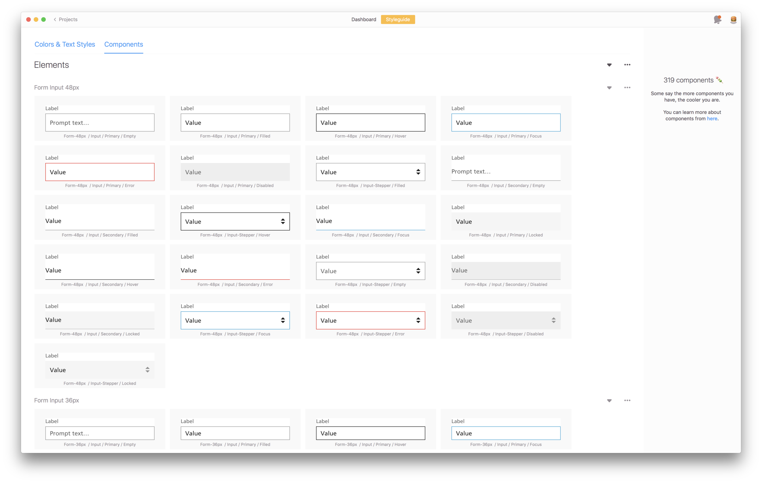
Design language with 400+ components in Zeplin
UX/UI documentation
Hi-fidelity product designs
70+ interviews and usability tests with stakeholders and users
10+ prototypes illustrating hero flows and use cases
30 person workshop with key stakeholders
Design research shareout deck
3 online Usability Hub tests delivered to 150 participants
Design Research
We spent the first few weeks of the program immersing ourselves in the environment. We interviewed Financial Advisors (FAs) and Customer Service Advisors (CSAs) from four different UBS locations at their desks to watch them use their current tools.
We ran an all-day interactive workshop with key stakeholders to create alignment amongst themselves and build empathy with their employees.
We took the insights gained from in-field research and the workshop and delivered an in-depth 100+ page design research deck to the client.
Weekly Design Sprints
The team started doing weekly design sprints. On Monday we talked with Subject Matter Experts and by Friday we were testing the design work from the week in a prototype with full visual designs. I was responsible for drafting the discussion guides and running half the sessions.
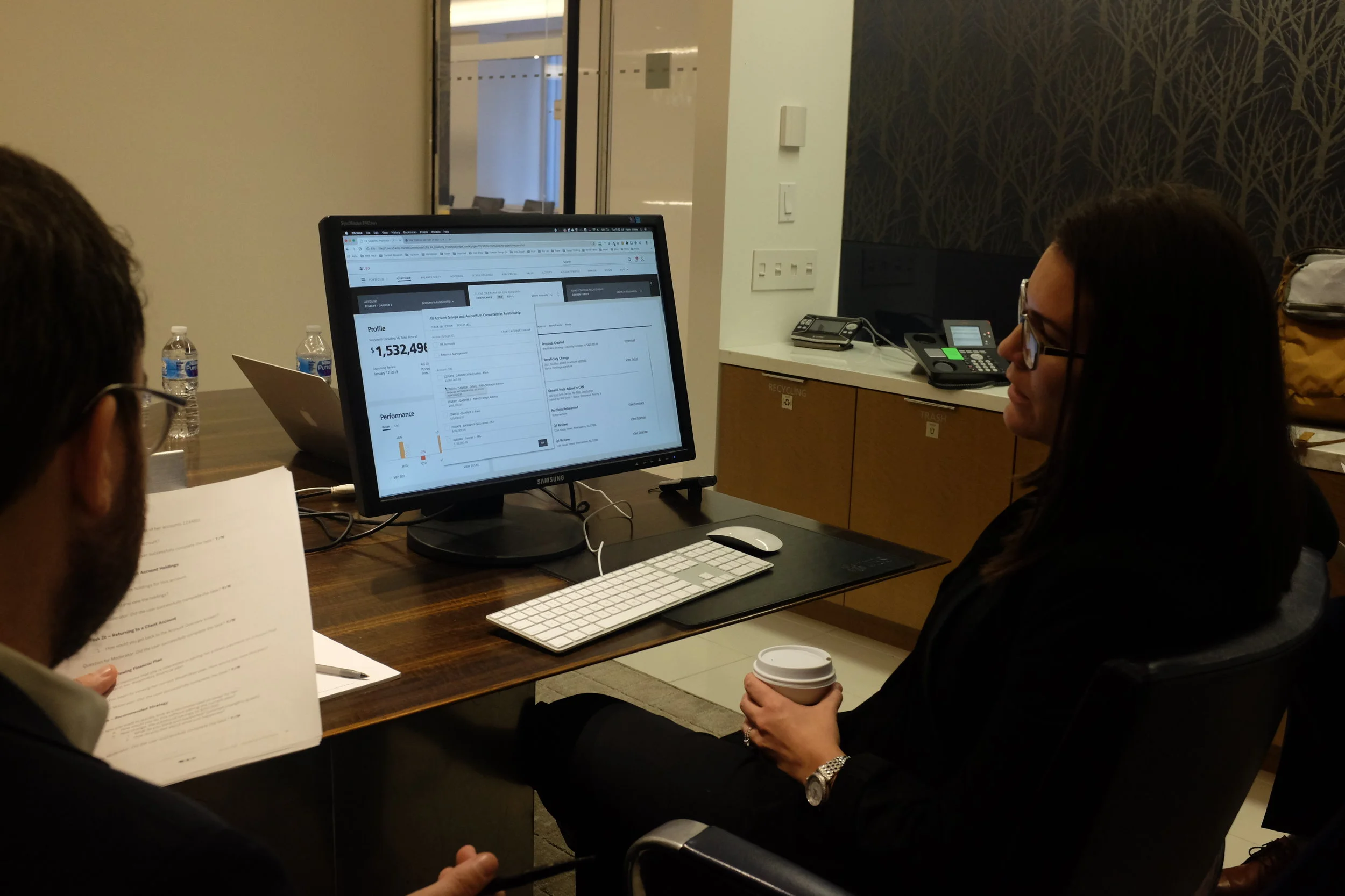
Usability testing with a participant.
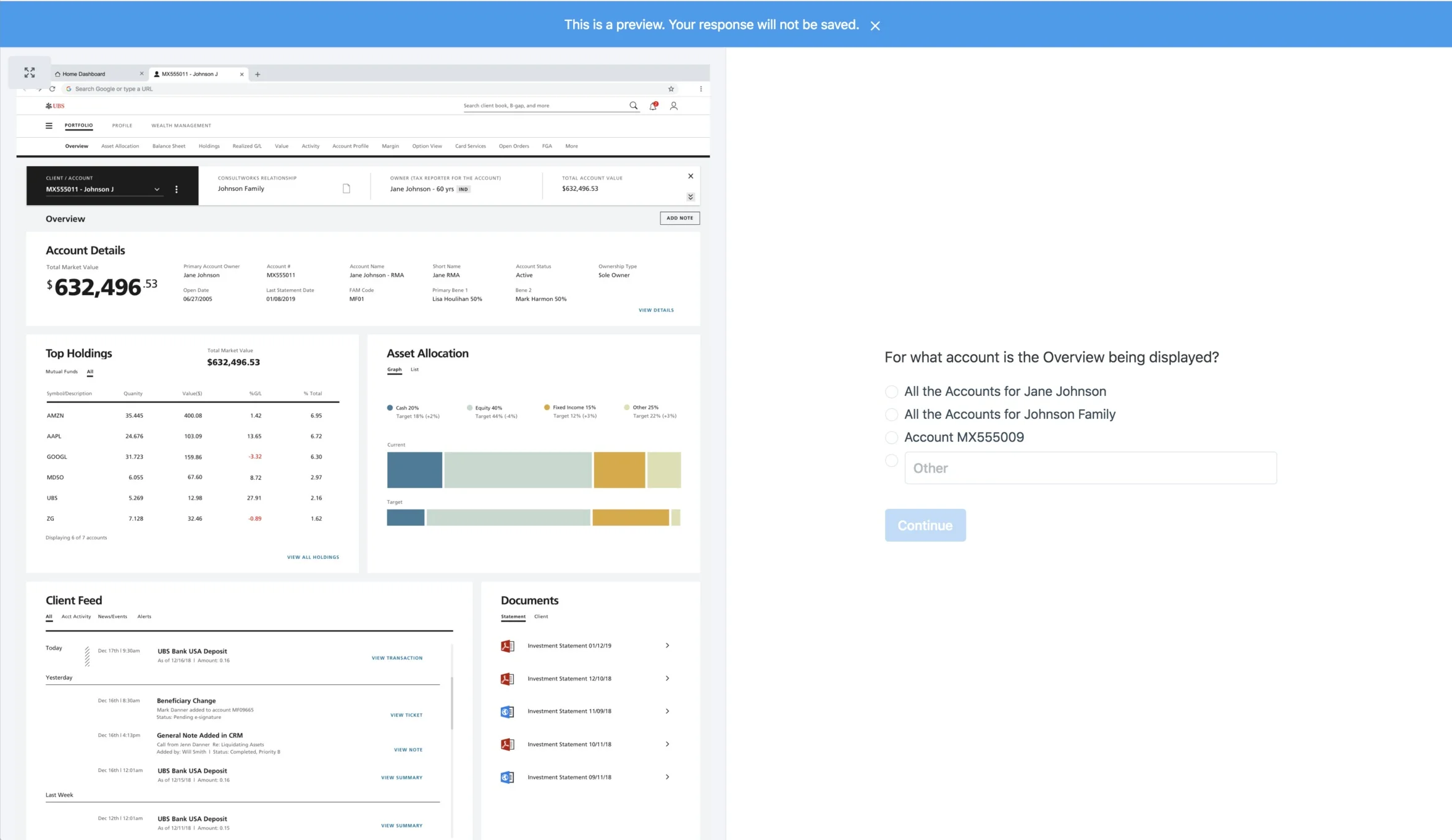
To supplement the usability testing sessions, we sent out several online tests to augment our insights by leveraging Usability Hub to a pool of 60 participants.
Example of Usability Hub test
Interaction Design Guidelines
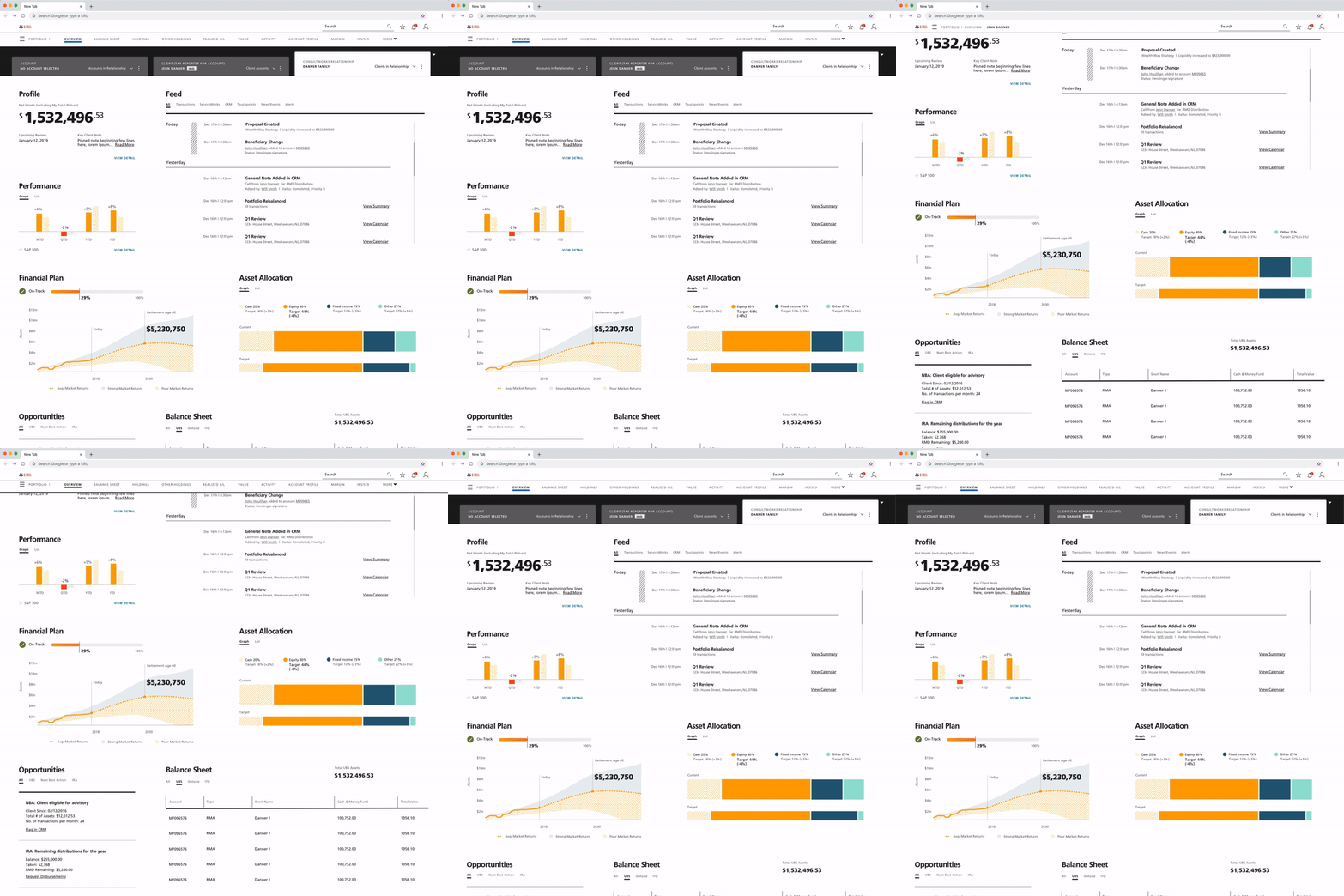
As part of our deliverables, I was responsible for documenting the interaction design guidelines. This outlined intended system behavior and motion of system components.
Example of a scrollable header I created to demonstrate how the system-level header would collapse and expand as the user scrolled up/down.
Design Language Delivery
On top of Interaction Design Guidelines, Visual Design Guidelines, we delivered our design language components in Zeplin. This included typography, color palette, components, and common UX patterns that illustrated how the design language came together. I oversaw the transfer of all our assets into Zeplin.


