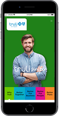
Truli Website Brand Launch
Project Summary
Florida Blue, a health insurance company, hired Havas to help launch a new company/product called Truli for Health, aimed at SMB in Florida. We helped extend their brand guidelines, create a tone-of-voice, and launch their website.
Beginning with workshops and interviews, we developed personas based on the various audiences of the future website. The site was to be used by 5 different audiences all with different motives. We created a narrative that would highlight the most important of the journeys and designed wireframes from this backbone.
Serving as lead UX I was client facing, laid the foundation and architecture for concepts and design, worked with my team to wire out the entire site, and consulted with the engineering team to ensure compliance to experience and accessibility standards.
Some of the things we did over the course of the project:
Business context assessment
Competitive analysis
Persona development
Information architecture
User experience strategy
Detailed annotated wireframes
Prototyping
Visual designs
Usability Testing
Discovery and Strategy
We conducted a series of in-depth interviews with stakeholders and proxy users to learn about the context of the project, which culminated in a findings document that outlined our business strategy, target market, and sales journeys for each identified user segment.
Additionally this findings document included a competitive analysis and detailed the website requirements we would need to meet for design and build.
Sitemap
By using the site requirements, strategy, and personas created in our Findings & Strategy deck, we created a sitemap that mapped the future content into a structure that would make the most sense for the multiple audiences.
An early version of the sitemap showing how we were addressing content for multiple audiences.
Detailed Annotated Wireframes
As part of our deliverables, we delivered detailed annotated wireframes to outline navigation, interaction design, and intended behaviour for both desktop and mobile.
Detailed Designs
We applied a modern design aesthetic to give the page a playful, fresh, and colourful look to differentiate it in the healthcare vertical. The designs adhered to all accessibility standards and expanded the existing brand guidelines by adding new colours, shapes, iconography, and imagery.
We applied colour, spacing, and placement to the navigation to encourage visitors to explore the benefits and strengths of the product rather than cater to existing members, since the focus of the site was to attract new business.
Results
A website and longer term strategy with a flexible website design intended to be able to make the gradual shift from a sales focus to a member focus. Truli also was able to enhance their brand and tone of voice with our guidance.
You can visit the site here: https://www.truliforhealth.com/


