FIS Northstar Design
Project Summary
FIS is an international provider of financial services technology. They asked frog to help them conceive a forward thinking banking solution that they can work toward releasing in the next 1-2 years. We were a team of 5 and I was Sr Interaction Designer. There was four weeks to generate a concept, and design three screens and flows for both desktop and mobile web.
Immersion
We began by immersing ourselves in stakeholder and partner meetings and demos to understand the functional and technical requirements of the future FIS platform. It became clear we needed to create a digital first design, however it must be extensible to the needs of their Financial Institution (FI) clients.
In/Out of Category Experience Audit
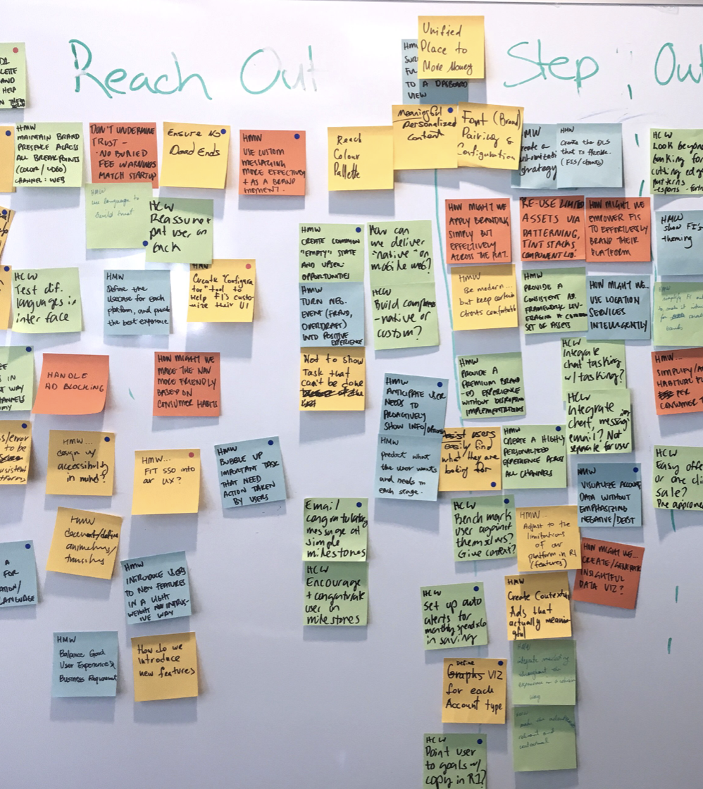
We reviewed over 35 competitive/ comparative experiences and furthered our research by looking at global tech and financial trends. From these learnings we created five design territories:
Conversational UI
Digital Assistants
Social Commerce
Command Center
Contextual Awareness
UX Concept
After analyzing our research, brainstorming, and exploring inspiration, we landed on this UX concept:
Our UX concept
Interaction Model
To minimize complexity across the platform we kept the information architecture at two layers deep. We were able to do this by creating workflows that were untethered to the information architecture and could be launched anywhere without leaving the user’s current context. These function like modals but are actually pages, which improved accessibility, screen real estate and cognitive overload.
Page Architecture
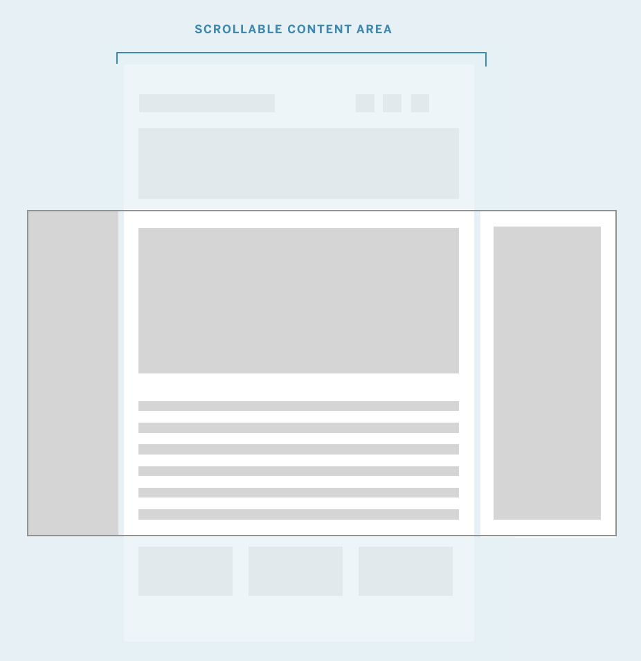
The page was divided into thee main sections:
Left — Fixed primary navigation
Center — Scrollable content area
Right — Fixed insights and chat area
Wireframes for Desktop
Once the UX concept, interaction model, and page architecture were nailed down, we began to wireframe for desktop. I was responsible for the transaction flow.
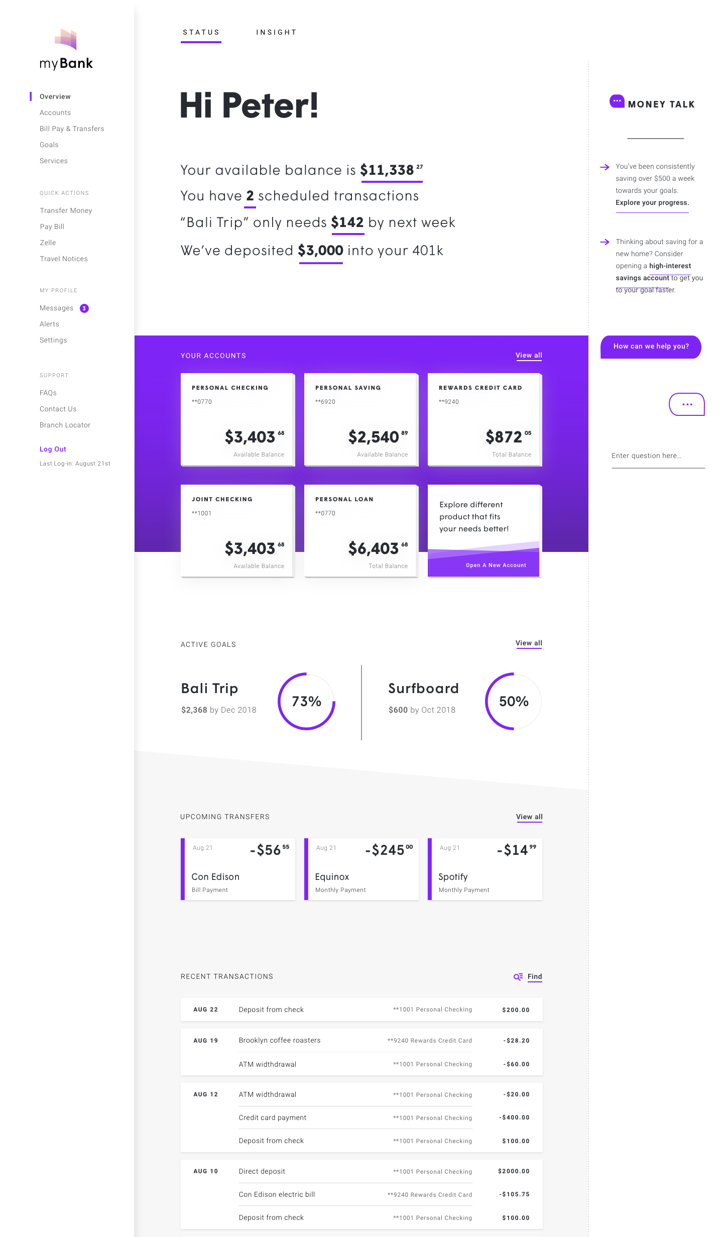
One of my wireframes showing the navigation on the left, content in middle, and AI insights on the right.
In a workflow, primary navigation becomes a breadcrumb to the page where it was launched.
Wireframes for Mobile
After the desktop wireframes were approved, we designed the wireframes for the mobile web experience. See these wireframes in a prototype here.
Visual Design
Visual design used a single bold color and played between thick and thin lines. The client called the work “tremendous” and is currently planning to integrate the designs into their sprints.


